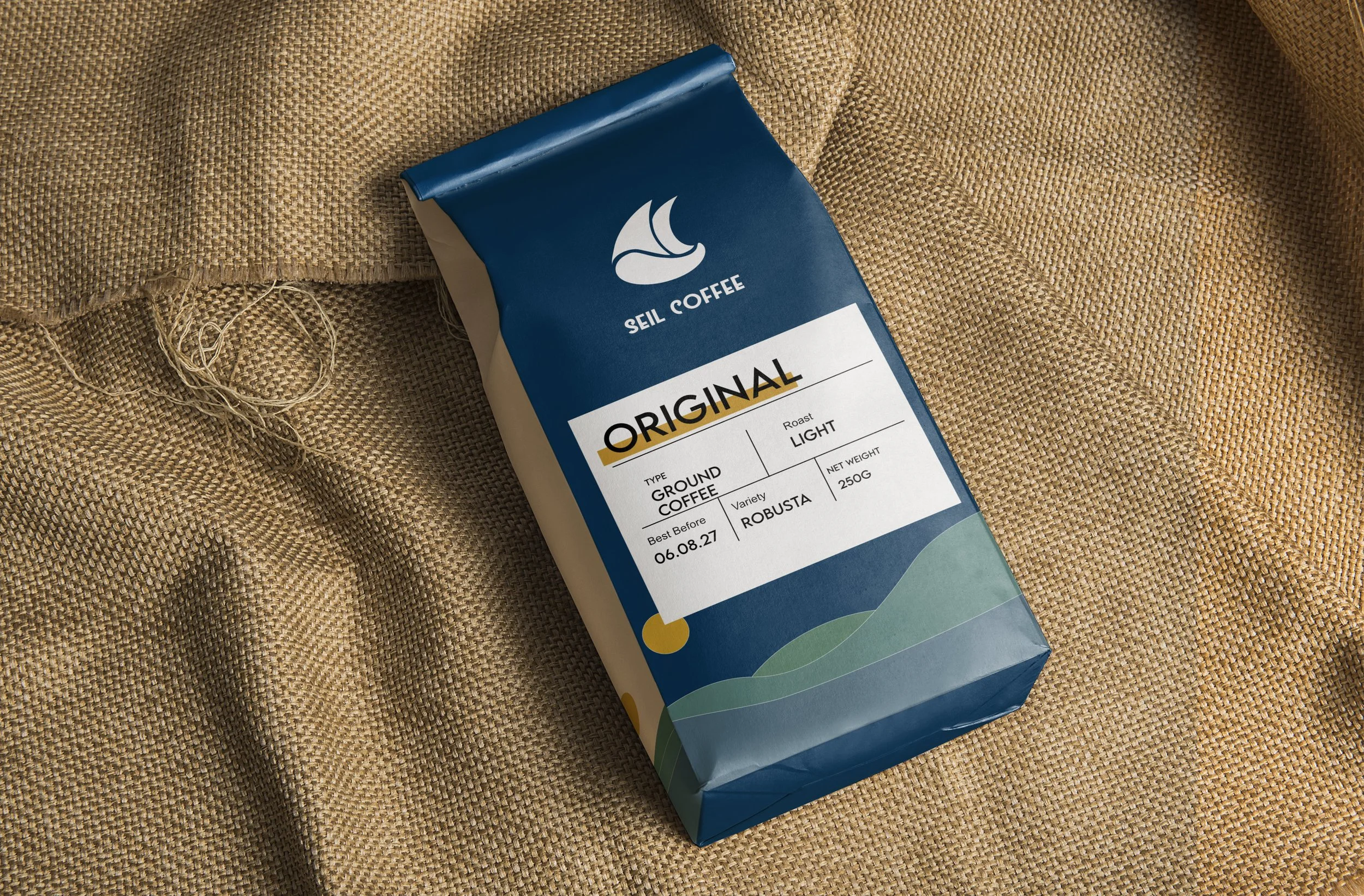
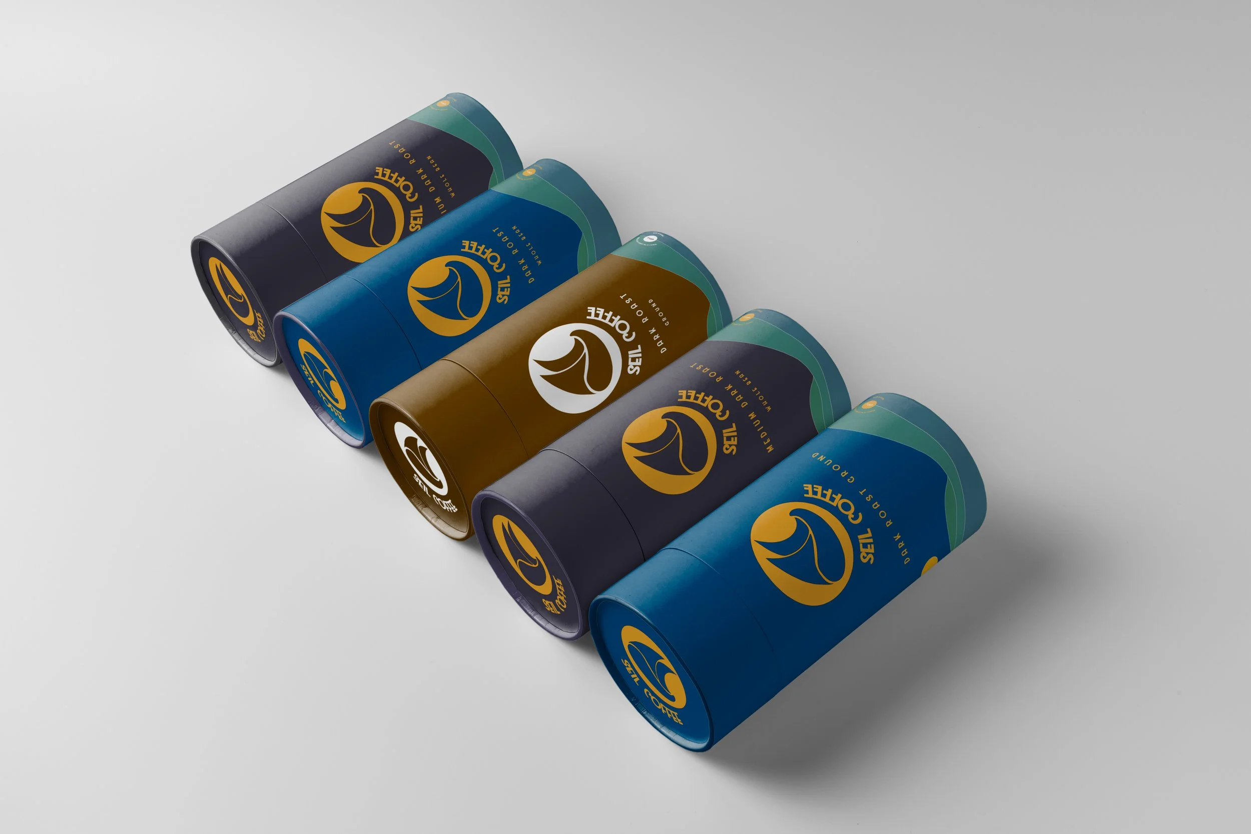
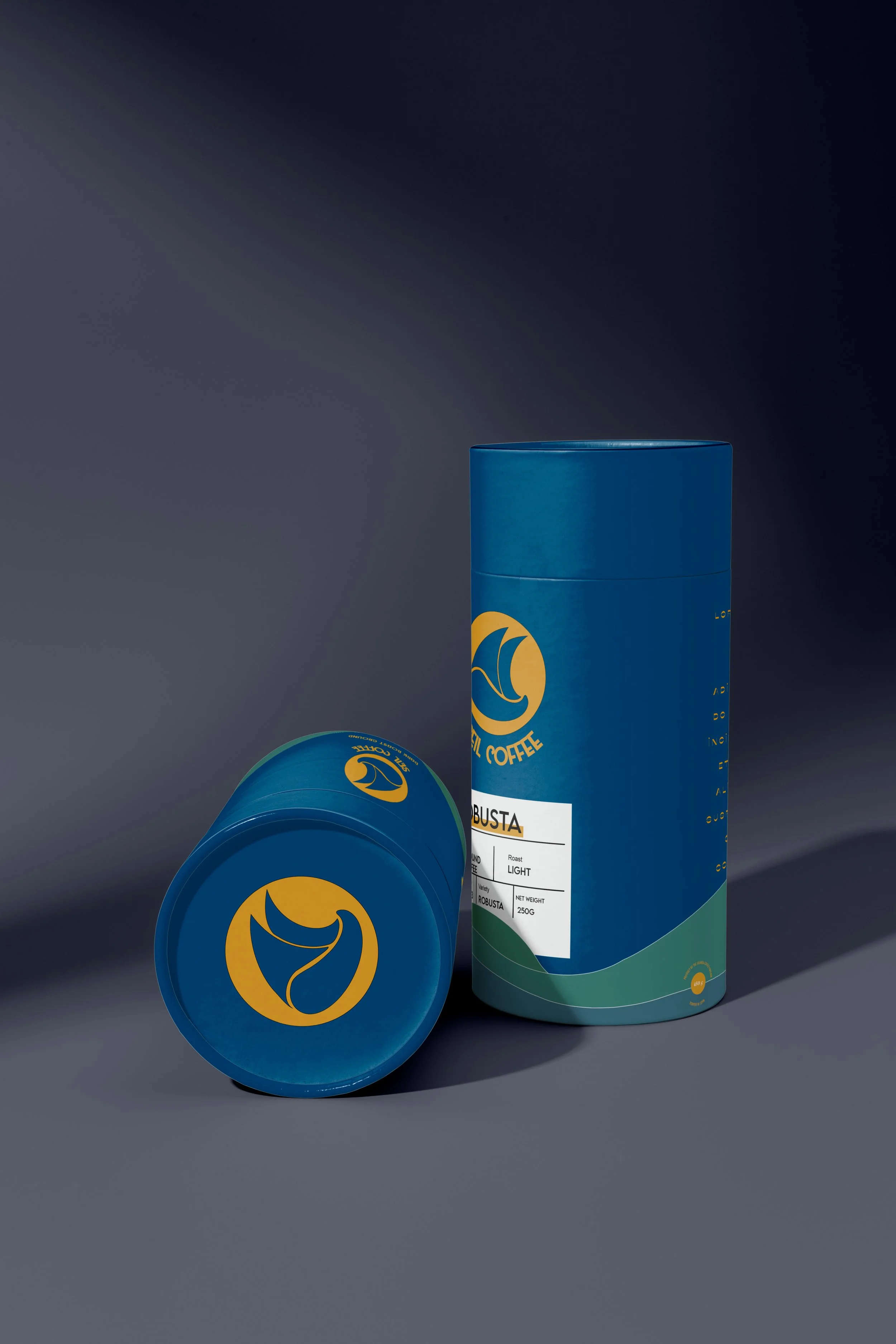
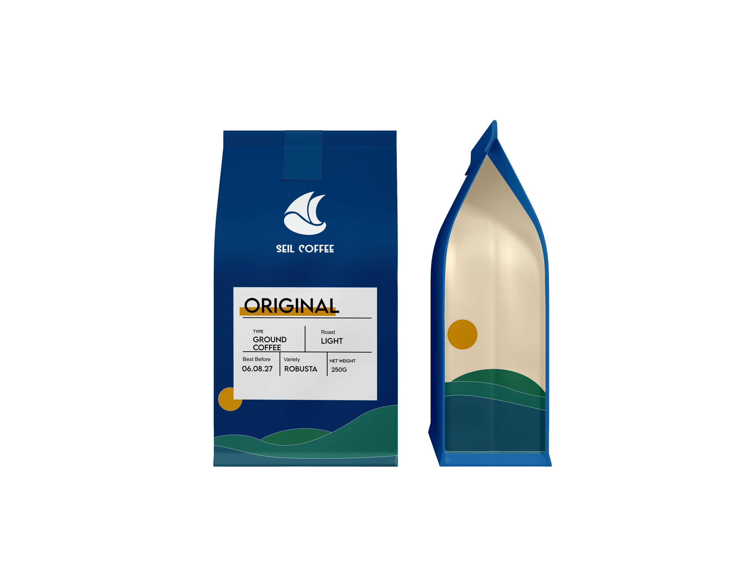
Seil Coffee
Seil Ltd, a general trading conglomerate looking to begin selling packaged coffee directly to consumers, needed a brand identity and a unique packaging design ready for the market. Vin and Sage designed their logo, together with applicable brand assets, registered their IP, and is currently in charge of all their go-to-market activities.
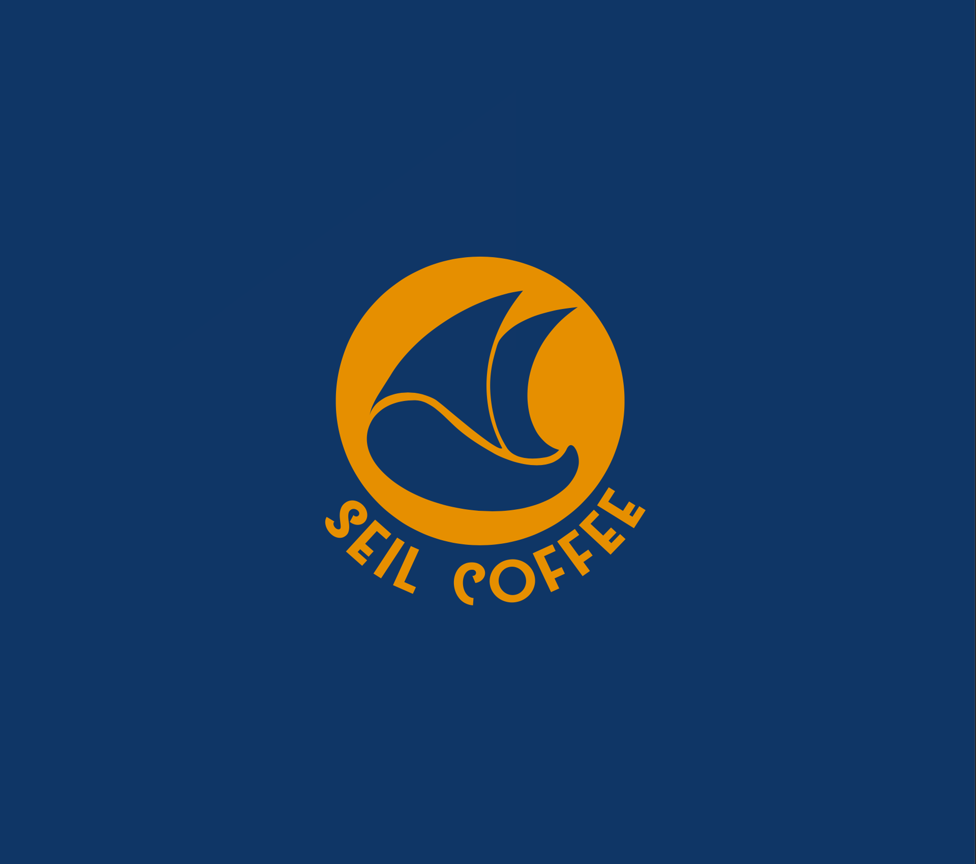
The logo is inspired by the name Seil, which is similar to Sail. The logo is made up of two sails sitting on one half of a coffee bean. Our logo is made of two parts: the logo and the name text. Both parts are separate entities that can be used independently in accordance with the company guidelines.