
Seil Coffee
A deep-blue and gold SKU-family system built for retail and export — packaging that survives distribution and reads on any shelf.
← All work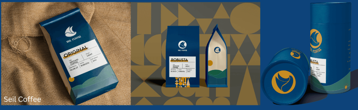
Seil Coffee needed a packaging family that could hold together across a growing range of SKUs — and hold up across very different retail contexts, from local shelves to export markets, without losing recognition or looking improvised as the range expanded.
We built the system around a deep-blue and gold identity: a fixed structural grid that stays constant across every SKU, with controlled variation — roast, origin, format — carried by a small set of clearly defined slots. New products drop into the system instead of redesigning it.
Every pack was designed for the realities of distribution: materials and finishes chosen to survive handling, label layouts that meet export requirements, and artwork delivered print-ready with dielines so any vendor can produce it consistently.
Sector
FMCG
Services
Brand Identity & Design
Packaging Design & Sourcing
Deliverables

Retail shelf lineup
Single-SKU detail
Export carton
A shelf-ready family that reads as one brand at a glance, scales to new SKUs without design debt, and travels — from Kampala retail to export shelves.

Have a brand to build?
Tell us what you're launching. We'll reply within one business day.
Start a project →